Does somebody has a CSS template with basic features like border color, text color, text align, text font, text size, hover color etc. ?
This can be accomplished by inspecting the element you wish to modify then adding the attributes you wish to change. There isn’t a template, but if you have some ideas of what you want changed I might be able to help get you close.
Hi Ben,
Could you let me know how to change the following on the Soft Cell Theme :
All Background Colours
Button Hover Colour
Required Field Asterix’s on Booking Form
‘Confirm Booking’ Button on Booking Form
Thanks
@Chris This may get you started. Swap out the black (#000) with whatever color you need.
 /*Page background */
  html{background-color:#000!important;}

/*Content background */
 .content{background-color:#000!important;}

/*Header background*/
div.header { background-color:#000; }

/*Grid background */
div.main { background: #000; box-shadow: none; }

/*Instructions background */
.instructions{background-color:#000!important;}

/*Free time Hover */
.gridPage .gridDay .gridSlot.gridHighlight {background-color: #000000; border: 1px solid #fff;}

/*Required */
div.item.required div.itemLabel p:first-child:after {
color:#000000;
}

/*Submit button */
.dialogue .formButtons #submitButton:hover {
color: #000;
background: #fff;
}

.dialogue .formButtons #submitButton {
background: #000;
border-color: #000;
color: #fff;
}Thanks Ben that’s really helpful.
Any chance you could also let me know:
The Jump To Date button
Booking Form Questions Text
Thanks again
@Chris the jump to date stuff is a bit tricky. It isn’t a button but an image. Also the UI elements are all seperated out. Here is the code to help you. Be sure to change then URL of the image to something you have license to use.
/* Date Picker */
.ui-widget {
    font-family: 'Roboto', 'Helvetica', 'Arial', sans-serif !important
}

.ui-datepicker .ui-datepicker-header {
    font-family: 'Roboto', 'Helvetica', 'Arial', sans-serif;
    font-weight: 500 !important;
    border-radius: 2px !important;
   border-color: #000!important;
   background-color:#000!important;

}

.ui-widget-content {
    border: 1px solid #e4e4e4 !important;
    background-color: #ffffff !important;
}

.ui-corner-all,
.ui-corner-top,
.ui-corner-right,
.ui-corner-tr {
    border-radius: 4px !important;
}

.ui-datepicker th {
    font-weight: 500 !important;
    color: #000 !important;
}

.ui-state-default,
.ui-widget-content .ui-state-default,
.ui-widget-header .ui-state-default {
    height: 32px !important;
    width: 32px !important;
    font-weight: 400 !important;
    border: none !important;
    padding-top: 7px !important;
    color: #000 !important;
}

.ui-datepicker .ui-datepicker-prev span,
.ui-datepicker .ui-datepicker-next span {
    margin-top: -10px !important;
}

.ui-datepicker .ui-datepicker-title {
    font-size: 0.7em !important;
}

.ui-datepicker table {
    margin: 0 !important;
    font-size: 0.7em !important;
}

.ui-datepicker td {
    padding: 0 !important;
}

.ui-datepicker {
    width: 12em !important;
    margin: 37px 0 0 0 !important;
    bottom: auto !important;
    -webkit-box-shadow: 0 2px 5px rgba(0, 0, 0, 0.1), 0 2px 5px rgba(0, 0, 0, 0.1) !important;
    box-shadow: 0 2px 5px rgba(0, 0, 0, 0.1), 0 2px 5px rgba(0, 0, 0, 0.1) !important;
    padding: 10px !important
}

.ui-state-active,
.ui-widget-content .ui-state-active,
.ui-widget-header .ui-state-active {
    background-color: #000 !important;
    font-weight: 500 !important
}

.ui-state-highlight,
.ui-widget-content .ui-state-highlight,
.ui-widget-header .ui-state-highlight {
    color: #ffffff !important;
    font-weight: 500 !important
}

a.ui-state-default:hover {
    background-color: #e4e4e4 !important;
color:#fff!important;
}

.ui-datepicker-next.ui-corner-all .ui-icon.ui-icon-circle-triangle-e,
.ui-datepicker-next.ui-corner-all .ui-icon.ui-icon-circle-triangle-e:hover {
    background-position: -32px 0 !important
}

.ui-datepicker-prev.ui-corner-all .ui-icon.ui-icon-circle-triangle-w,
.ui-datepicker-prev.ui-corner-all .ui-icon.ui-icon-circle-triangle-w:hover {
    background-position: -96px 0 !important
}

.ui-state-highlight,
.ui-widget-content .ui-state-highlight,
.ui-widget-header .ui-state-highlight {
    border-radius: 4px !important
}


.gridPage .jumpDate .ui-datepicker-trigger {
    color: #fff;
    background-image: url('https://freeiconshop.com/wp-content/uploads/edd/calendar-outline-filled.png');
}

.ui-datepicker-prev.ui-corner-all:hover{background:#e4e4e4 !important;}
.ui-datepicker-next.ui-corner-all:hover{background:#e4e4e4 !important;}

 /*Booking Form Labels */
.itemLabel{color:#fff!important; font-size:25px;}

 /*Booking Form Content */
.itemContent{color:#fff!important; font-size:25px;}Thanks for that Ben, worked a treat!
For some reason the ‘Submit Button’ on the booking page has now changed size. I have only changed the colours on this, any idea why this might be?
It looks like the font-size of the form elements carried over I removed that from your CSS. Should be good to go.
Thanks Ben, thats great, really appreciate all your help. I’ll leave you alone for a while now haha! Cheers again 
1 Like
@Ben Im using theme “Flat Minimal”
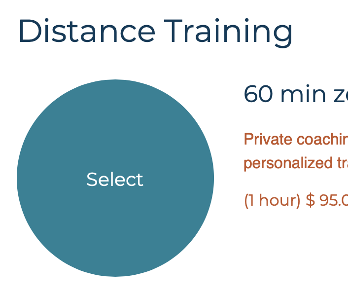
this was super helpful to me. i wanted to change the free time hover to a logo color. and the code here worked perfectly. but there is another button that i really wanted to change : Our YCBM page is embedded in our website and the large ‘select’ buttons which appear in front of appointment types on our website are a standard blue. Ive added an image (as per standard options in the “apppointment type” dashboard area). that the button changes to blue and says ‘select’ when hovered over. I’d like that color to be a branding color. to be can you help with that code, please? or maybe could you just give the ID of that item?
attaching image
thank you
1 Like
replying to myself : that button appears in front of the appointment types . . . and when it is blue, it says 'select" . . . (just trying to further identify the button to which i’m referring) thanks!!
attaching image
To change the background color for services and teams on flat minimal use these classes:
.service .servicePic, .team .teamPic {background:#fff;}
For those who want to do some customization, here is the designer guide location. Designer Guide
One thing to be mindful of here is that custom CSS is not available on the new experience. We hope to have more customization options in the future to help get folks close to the modifications they want to make with CSS. Feel free to provide feedback on changes you would like to see. You can do that in #feature-requests.
Hi Ben,
To be clear then, there’s no way to edit the CSS on the dialogue box to make it wider than the 420px that comes as standard?
(use case - I have it embedded on a wordpress site, where it looks pinched and mean, when I’d like it to be 75% of the iframe width)
@boyler sorry on the delay. Correct, no way to adjust that right now. The booking grid will be mobile responsive so even if it is in a smaller frame on your site it should still work. I tested out your contact page on my desktop and Android phone and it worked as expected.
Hey guys,
this link: https://youcanbook.me/design_guidelines
Does not work. YCBM is so flexible and awesome but so ugly, it is the only reason we moved away from it. Still have not found anything as good as YCBM, but that table with all the times is just too ugly to use in our case!
How do I change that/prettify it?
@woyago welcome to the Forum! We no longer support custom CSS. What types of changes were you looking to make? You can embed the booking page on your website to have more control over how things will look, and plugin in the booking grid.